Revamp the POS design on the iPad for Pet Groomers and Barbers

iPad POS: Improve the existing point of sale experience—29 sec faster checkout!

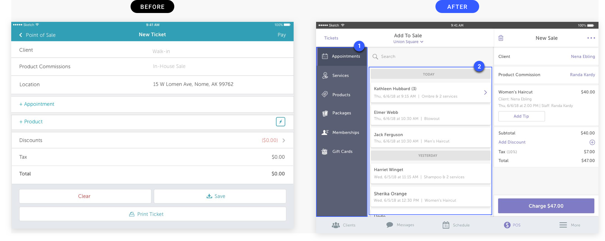
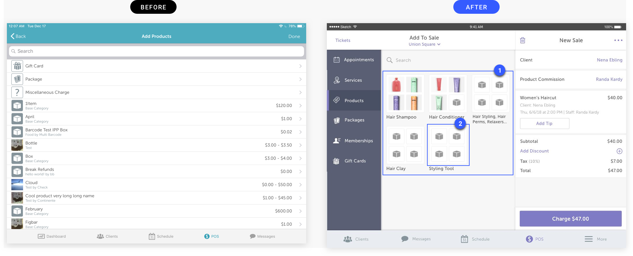
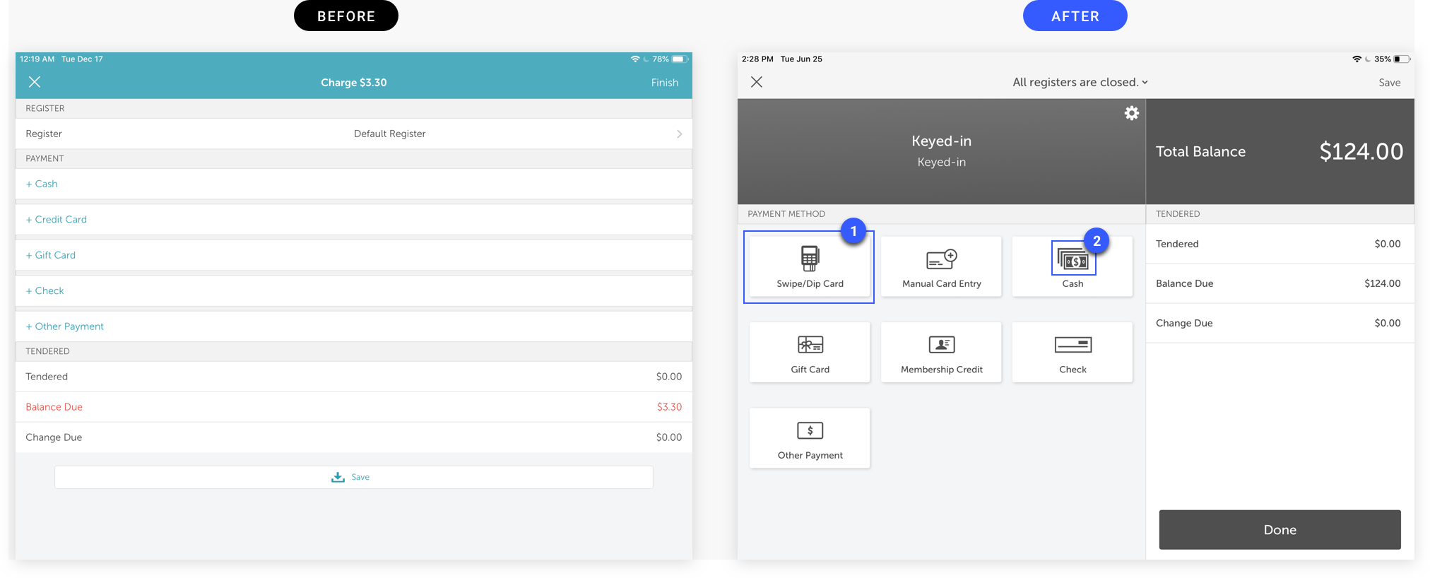
Many pet groomers and barbers are super busy that they need to check out their customers faster so they could provide the service for their next customers. However, it seems like our current POS system couldn't satisfy their expectations. There were some complaints that the design wasn't intuitive enough that they can locate everything they want in one glance.

Duration

December 2018 - June 2019

Team

Edith Cheng (Sr. UI/UX Designer), Fernando Bunn (Sr. iOS Developer), Ethan Anderson (CEO), Kay Kim (Sr. UI/UX Designer)

My Role

Help with research, lead the interface design, and simplify the UX

Challenge

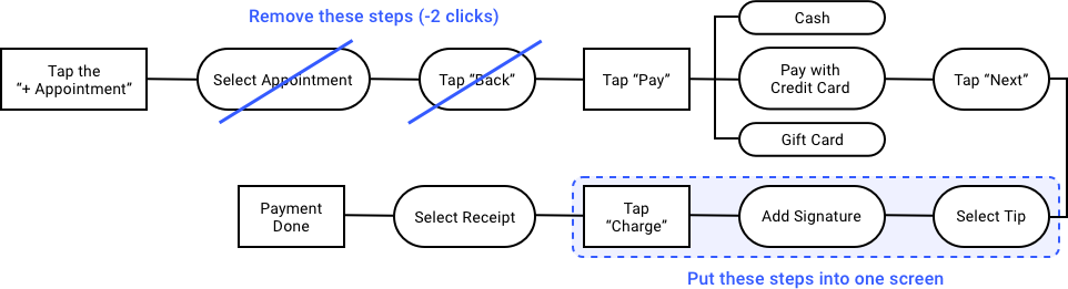
The staff complains that the existing POS delays the customer’s waiting time because it takes so long to checkout. 
“How can we make it faster and easier to use?”

Goal

Shorten the checkout time to 31 sec and reduce the number of clicks

Research

Researched similar POS systems and tried to evaluate what makes their products better. The key takeaway was to use two grid systems and categorization.
— Screenshots from Shopify, Square and TradeGecko

Discovery

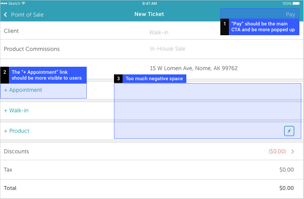
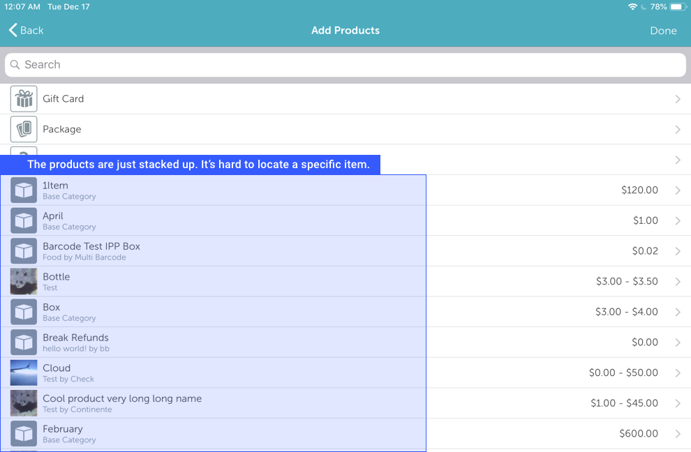
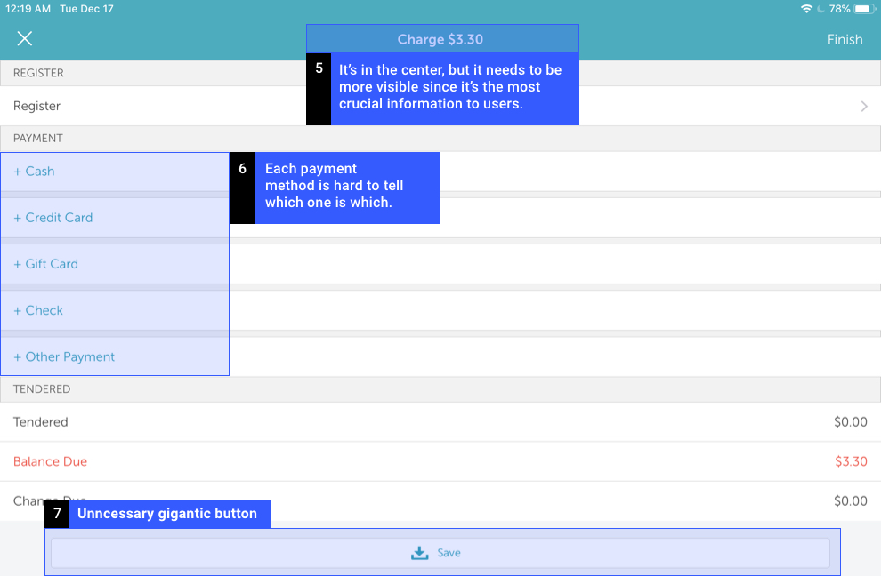
Discovered our existing product is lacking visual hierarchy and have too much negative space. Our users felt pain of finding which button to tap.

Revise UX

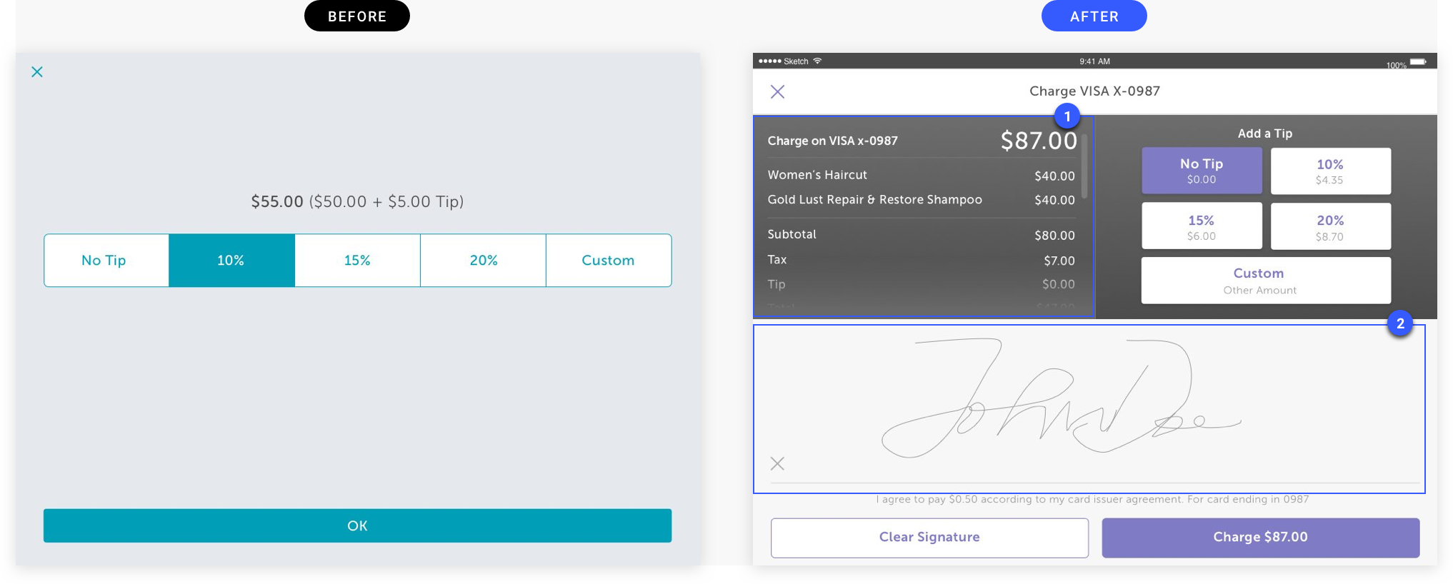
Incorporating the two grid system in UI, we could simplify the experience by reducing some steps.

Solution 01

Use space more effectively by using two grid system.
1. Put navigation and “New Sale” side by side — increase accessibility
2. Expose individual appointments on the main screen — reduce two clicks

Solution 02

Use categorization.
1. Organize products by category — increase visual hierarchy
2. Having three boxes in a row prevents it pushes down the screen — increase visibility

Solution 03

Use icons and make the buttons bigger.
1. Increase the button size and add the shadow — increase visibility
2. Add icon to each payment method — increase visibility

Solution 04

Put individual steps into one screen.
1. Show summary on the top left helps staff to double-check the details — increase accessibility
2. Allow tip and signature in one screen — reduce one click

"It's live on production!"

“29sec Faster!”

Compared to the old design took an average of 63 seconds, the new design took an average of 34 seconds. Although it’s 2 sec slower than our goal, our merchants were satisfied with the better look and faster speed. MyTime is now selling iPad POS with more confidence!